maanantai 1. huhtikuuta 2019

JS1k 2019 writeup part 4 - Magical Light Tunnel


My 2019 JS1k entry "Magical Light Tunnel" was inspired by Marks & Marks demo reel from circa 1981. I found that video years ago on YouTube and loved the old school audio and visuals. I decided to try and implement a section from it.

1. Copying and creativity


Most of the graphics in the demo reel are just wireframes and dots. They are visible even when they are behind other objects. This changes during the tunnel sequence - the lights that shouldn't be visible are clipped. I had done a short tunnel demo previously on dwitter.net and pavel did a remake of it that had clipping. I decided to use the same approach but using polygons instead of arcs. Soon I had the first version running.


I refined my new tunnel engine and got so inspired by it that suddenly I was filled with ideas. I wanted to let my creativity out instead of carbon copying the video. I collected more inspiration by searching light tunnel videos and hallway architecture images. Below are some notes I had written down.
  • Create shapeshifter plugins that alter the tunnel shape
  • Create switcher plugins that turn individual lights on / off
  • The further you go, the more you experience
  • Let's create something special!
Going from copying to creating is something that happens often with arts. Don't wait for inspiration - start to work and you will find it!

2 . Tunnel engine


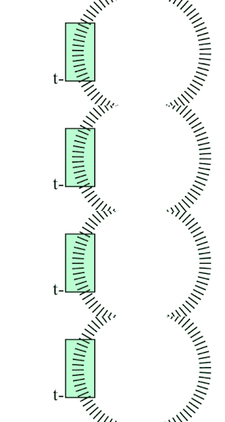
The tunnel engine is best described by a set of requirements and illustrations...
  • Tunnel is a loop of indexed layers
  • Viewer position in the tunnel is t
  • Visible segment is 24 layers forward from t
  • Layers are closed 2D polygons that have 24 sides
  • Polygons are drawn front to back
  • Each polygon forms a clipping area that clips the drawing of the next layer
  • Polygons are filled with transparent color
  • Polygon sides are sometimes drawn to form a gate
  • Polygons are scaled based on distance from viewer
 
  • Polygon points are lights that are either on or off
  • Polygon has a center that is the local space origin for its points
  • Polygon points are vectors created with rotation formula
  • Vectors can have varying length
 

The importance of clipping is easy to understand from the comparison below. On the left the polygon outlines are drawn for each layer in full. Clipping makes the tunnel more realistic and clean looking.


3. Shapeshifters


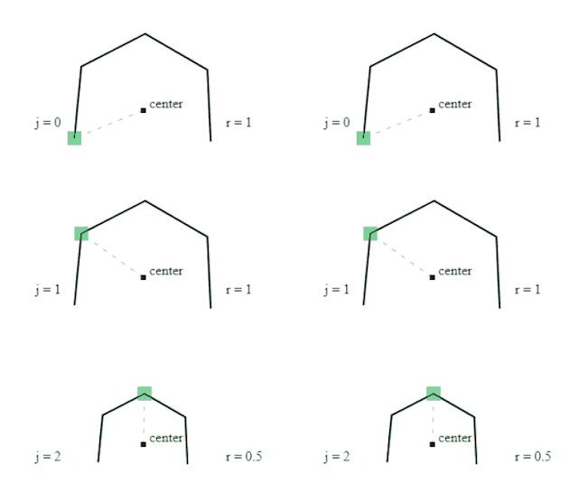
Shapeshifter plugins manipulate vector length based on position of layer and current point index j. They return a multiplier to use in rotation formula calculation. Below you can see how the shapeshifter formulas alter the tunnel shape. First shape is the default where each polygon point vector has a length of 1. It can be mixed with the square shape to form a cool corridor. Square can also be tilted to form a spiral tunnel. The third shape I call the circus entrance. Last example is a cave achieved with filter expression Math.sin(j >> 1 & p) / 3 + 1 where j is index of current polygon point and p is layer position. Because p is different for each layer we get variations in the resulting shape.


4. Switchers


Switchers decide if the current polygon point light source is switched on or off. They are expressions that resolve to true or false based on input and are used to animate the lights. At the very beginning of the demo we only activate two lights on opposite sides to create railings. The expression for this is j % 17 == 3. When we only want the top lights on we can use j > 9 & j < 14 which we can shorten to j % 14 > 9.


To get more complicated patterns we'll use more arguments. For example Math.sin(j + p + t) < 0 gives us a hypnotic spiral.


I created a lot of different filters and chose the ones that had the best bang for the buck. These filters were then arranged to form a storyline where things would get more interesting the further we go. I ended up with a really long demo. I got comments that maybe it was a bit too long so I got rid of some of the filters to make room for a surprise ending...

5. Breakout


So there needs to be a treasure behind the crystal cave. 3D diamond was my first thought but it was too obvious. I wanted something that the viewer wouldn't expect but at the same time it would make sense in a programming competition. I had done mini tribute demos of Tetris, Breakout, Defender and Invader and I knew I could do any of them with the remaining bytes. Breakout was the most suitable choice. It has walls just like the tunnel and I could do physics that react with them. Below is a short screen capture from dwitter.net.


6. Conclusion and source code


I really hope JS1k 2019 won't be the last time this awesome competition is arranged. It has inspired and entertained programmers worldwide. It was my introduction to code golfing in 2013 and what a journey it has been. Huge thanks to the organizer Peter van der Zee and all the participants and judges throughout the years!

At the bottom is the commented source code. I hope you enjoyed the demo and this article.

Follow me on Twitter if you want to hear of new demos and blog updates - @jylikangas

sunnuntai 31. maaliskuuta 2019

JS1k 2019 writeup part 3 - Strigiformes


Most of my better known wildlife images are of owls and birds of prey have fascinated me since I was a little boy. Once while going through images on Pinterest I saw a cool art design where feathers had owl heads. It was created by Oleksandra Barysheva and can be seen on her Threadless page. I decided to try and do my version of it and see how many recognizable owls I could fit in 1024 bytes of JavaScript...

1. Feather function


To draw one side of the feather we first build two nested loops. Inner loop draws a single barb away from the shaft while the outer loop moves us upwards to the next starting position.

for(j=120;j--;)for(i=j;i--;c.fillRect(i,-j-i,1,1));

The above code shows the basic loop structure. Then step by step we begin to add rules for the barb length and make them curve resulting in a very natural looking shape...


We then put this loop inside a function which allows us to use arguments for variation. To create the other side of the feather we can use scale(-1,1) to flip the x-axis and then call our function again.

Now that we are happy with the shape of the feather we can add colors. We make the brightness change based on the values of loop iterators. The shaft and first barbs need to be white. A nice gradient for the length of the barb and some natural looking variation and our feather function is complete.


2. Drawing the head in layers


To start the owl's head we use arc to draw an unfinished circle. On top of that we draw darker colored rays shooting out from the center. The tricky part is creating a loop to draw the two discs that are characteristic of owls. Eyes are in the center of these discs. Color of pixels change as we go further away from the center. Texture is achieved by adding smaller scale contrast changes using remainder. Eyebrows are done in similar fashion on top of the disc. Last but not least we do the peak with two small rects...


3. Repeating code


One of the strategies to fit a lot of code into 1kb is making different parts of the code look the same. The packer can heavily compress these repetitions. After I had done the great grey owl I repeated the same code and made just enough changes so that the next owl would be recognizable. I kept doing more species until I was out of space. To finalize the demo I grouped the owls nicely instead of having them in a line. I also came up with a variation to the feathers so it would look like some of the owls are spreading their wings.


Follow me on Twitter if you want to hear of new demos and blog updates - @jylikangas

lauantai 30. maaliskuuta 2019

JS1k 2019 writeup part 2 - ShadowBoX


Shadow box is a display case where objects are placed in layers to achieve depth effect. It was originally used to present memorabilia, but artists have taken this concept much further to create little worlds inside the frames. The most typical approach seems to be to cut silhouettes from cardboard and put led lights behind them. End results can be stunning. Creating a nature landscape in this style was the initial idea behind my ShadowBoX demo. As often happens once you start to work on something it can take a life of its own...

1. Recycling


To get off to a quick start I reused some of my dwitter.net codes. To build the trees I used a recursive function lifted from my "Fractal In The Wind" demo. I tried to avoid the typical straight lines look so I drew the trunk and branches with curves and set lineCap to round. I made the trees bend towards the center so they create a more intimate feel. Hills I could pretty much directly copy from "Parallax Mountains". I mixed the two together and added a CSS radial-gradient background. Just like that I had a PoC version done...


To give the landscape a more organic feel I added some randomly placed plants. They filled up the ground nicely and I though I could spend rest of the bytes on the storyline and animated objects. Since it was a moonlit scene having an owl flying towards the viewer was a must. I stumbled across a goofy bat animation on the internet and tried implementing something similar. I used the same drawing approach for the owl as I did for the car in the "Cruising the 80s" demo. Sine waves always provide a simple way to achieve natural looking movement. Adding rotation made the owl more interesting and unpredictable.

2. Simple solutions


At this point I thought I had a nice demo and could just polish it. Once I showed it to a colleague of mine, Rami Repola, he immediately commented that it should have fog and lightning. My initial reaction was of course "try to add that with one hundred bytes yourself!" Soon I realized that such effects would work really well to form a storyline. Only problem was that they'd require lots of new code. Or would they?

I realized that I already have trees which are kind of like lightning when you think about it. So I did a very simple variation of the recursive tree function. Also I could just bypass setting the background color of the canvas element during the lightning strikes and it would be left at the default white color. Best solutions often seem obvious but somehow are really hard to spot at first.


Because I'm using CSS to set the background color, the actual canvas is kept transparent. I draw some white pixels on the top of the screen. They have anti-aliasing, so when I make a huge stretched copy of them with drawImage, they are just this big blurred area. When I saw how well it worked I was really happy with myself for a moment. :)

3. Snowstorm


Doing weather effects reminded me that I also had a very short snowstorm implementation in "Magical Winter Forest" dweet.


Well why not add that to the mix as well!

4. Golfing never ends

If there is one thing I've learned about code golfing it is that there always seem to be more ways to make things simpler and shorter. When something motivates you to try harder you will eventually find a way. Although I had already spent the allowed kilobyte, I started to have more ideas for the demo. It could be great if the scene was beautiful and peaceful at first before things get crazy. Something like a sunrise and swans in the lake. Back to work!


I needed to change the composition and adjust the background color. I made the trees move when the storm comes. And wouldn't it be great if that owl attacked the viewer in the end!

One thing I eventually had to leave out was the framing of the box. No biggie really. Last little adjustment was to drop the frame rate lower for an old cartoon animation feel. I really love this demo and I'm planning to program more shadow boxes later just for fun!

Follow me on Twitter if you want to hear of new demos and blog updates - @jylikangas
perjantai 29. maaliskuuta 2019

JS1k 2019 writeup part 1 - Cruising The 80s


When I did a blog post about my "Cyber Auroras" demo a year ago the conclusion I wrote was this:
Inspiration and personal connection to the subjects will drive you to better performance and leave you a much happier programmer!
I had forgotten about writing that but luckily I had not forgotten the lesson learned. What that mentality has allowed me to achieve in the past year as a programmer is nothing short of amazing on a personal level. I went on to write countless 140 byte dwitter.net demos learning more about code golfing than in my previous years combined. It also made me go back to the fundamentals of JavaScript programming and I filled some important gaps in my understanding of them. This made me a better software developer in all areas - not just in code golfing.

When the 10th (and hopefully not final) JS1k came along I had many ideas and tricks to choose from. This resulted in the release of four very different demos which I'll now introduce to you one by one...

1. Retrowave


I went through a period last winter where I was really into the retrowave visuals and atmosphere. I spent one weekend trying to find the smallest possible snippets of code for producing each of the synthwave art cliche elements. I had a lot of fun combining some of them into dwitter demos.


When JS1k 2019 started I went back to that bag of tricks first and put the grid and the sunset as the backdrop for the demo. I wanted to add palm trees and a Lamborghini Countach to go all out on the theme...

2. Compressing SVG paths


I had previously experimented with Path2D drawing and finding ways to heavily compress the data. The approach I chose is based on the ability to scale and mirror the paths. The shape needs to be symmetrical and simple enough to draw half of it with a 10 x 10 grid. We will then need only one byte for each coordinate and only half of the coordinates need to be defined. I drew both the palm tree and the car with an online SVG Path Builder and compressed the data by hand.

Here's the code that draws the chassis of the Lamborghini with the coordinate range of 0-9 for both axes...

c.fill(P=new Path2D('M'+[...'944000014163040989']))
c.scale(-1,1);c.fill(P)

And here's how the path looks...


The data is a string of coordinates. M is the moveto command, but it turns into lineto automatically if you add more coordinates after the initial position. I've crammed all numbers together to save space and I use the spread operator to separate them. This goes as input for the array literal syntax that creates an array that has our coordinates as elements. When we add this array to the string "M" it is converted back to a string by the JS engine.  Below is this process step by step from the Chrome console so you can see what the interpreter does with our data...


Since we use fill it will close the path automatically for us. We don't need to define the last coordinate of the path.

For some special cases this approach could be taken even further by using relative coordinates and packing them inside 3-4 bits each. But that's for another demo in the future. :)

3. Adding details


To make the car look more authentic I added details around the chassis. The mirrors and the spoiler are done with simple rects drawn before the chassis and in slightly different shade of grey. This adds depth. The windscreen reuses a section of the chassis path and is slightly transparent. To mask the blockiness of the design I used a linear gradient to paint the car. It cost a lot of bytes but also makes a big difference. The glowing lights are a stack of scaled transparent white rects with shadowBlur.


4. Making music


You can't have a synthwave demo without music, right? As a longtime guitarist and songwriter I was very excited to start working on audio.  I had never done anything with the audio context in the past and sadly my initial excitement was soon gone after realizing the limitations of it. Not only does setting it all up take a lot of space but the basic sounds are just plain awful. I had to drop my dreams of a good sounding track and try to create something that was bad but hopefully bad in a good way.

The song itself I had composed years ago for the unfinished game called Owl Invasion. It was just one track of fingerstyle acoustic guitar produced into an electronic song. I split the bassline and melody to different oscillators and broke down the song into a code logic rather than trying to compress the data. I eventually managed to fit the parts in surprisingly small space but it really is just a complex set of brute force code golfing without a clear idea behind it. It worked but it's not pretty nor easily explainable.

I initially connected two oscillators to the same destination. After posting the demo I was informed that in some environments the sounds were painful to listen to. I replaced my first version with one that uses two destinations and also used less distorting oscillators. Luckily I managed to fit the changes without making any sacrifices in the visuals. I really like how during the chorus the background is animated to change into a desert scene.

Follow me on Twitter if you want to hear of new demos and blog updates - @jylikangas